My Location: OH


Bivariate Data8th Grade |
|
|---|---|
Alabama Course of Study Standards: 18 |
|
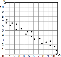
Construct and interpret scatter plots for bivariate measurement data to investigate patterns of association between two quantities, describing patterns in terms of positive, negative, or no association, linear and non-linear association, clustering, and outliers. |
|
Arizona Academic Standards: 8.SP.1 |
|
Construct and interpret scatter plots for bivariate measurement data to investigate and describe patterns such as clustering, outliers, positive or negative association, linear association, and nonlinear association. |
|
Common Core State Standards: Math.8.SP.1 or 8.SP.1Ohio's Learning Standards: 8.SP.1 |
|
Construct and interpret scatter plots for bivariate measurement data to investigate patterns of association between two quantities. Describe patterns such as clustering; outliers; positive, negative, or no association; and linear association and nonlinear association. (GAISE Model, steps 3 and 4) |
|
North Carolina - Standard Course of Study: 8.SP.1 |
|
Construct and interpret scatter plots for bivariate measurement data to investigate patterns of association between two quantities. Investigate and describe patterns such as clustering, outliers, positive or negative association, linear association, and nonlinear association. |
|
Alabama Course of Study Standards: 19 |
|
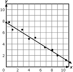
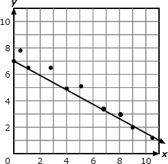
Given a scatter plot that suggests a linear association, informally draw a line to fit the data, and assess the model fit by judging the closeness of the data points to the line. |
|
Common Core State Standards: Math.8.SP.2 or 8.SP.2Ohio's Learning Standards: 8.SP.2 |
|
Understand that straight lines are widely used to model relationships between two quantitative variables. For scatter plots that suggest a linear association, informally fit a straight line, and informally assess the model fit by judging the closeness of the data points to the line. (GAISE Model, steps 3 and 4) |
|
Georgia Standards: 8.FGR.6.1 |
|
Show that straight lines are widely used to model relationships between two quantitative variables. For scatter plots that suggest a linear association, visually fit a straight line, and informally assess the model fit by judging the closeness of the data points to the line of best fit. |
|
North Carolina - Standard Course of Study: 8.SP.2 |
|
Model the relationship between bivariate quantitative data to: |
|
New York State Next Generation Learning Standards: 8.SP.2 |
|
Understand that straight lines are widely used to model relationships between two quantitative variables. For scatter plots that suggest a linear association, informally fit a straight line, and informally assess the model fit by judging the closeness of the data points to the line. |
|
Alabama Course of Study Standards: 20 |
|
Use a linear model of a real-world situation to solve problems and make predictions. |
|
Arizona Academic Standards: 8.SP.3 |
|
Use the equation of a linear model to solve problems in the context of bivariate measurement data, interpreting the slope and intercept. |
|
Common Core State Standards: Math.8.SP.3 or 8.SP.3Ohio's Learning Standards: 8.SP.3 |
|
Use the equation of a linear model to solve problems in the context of bivariate measurement data, interpreting the slope and intercept. For example, in a linear model for a biology experiment, interpret a slope of 1.5 cm/hr as meaning that an additional hour of sunlight each day is associated with an additional 1.5 cm in mature plant height. (GAISE Model, steps 3 and 4) |
|
Georgia Standards: 8.FGR.6.2 |
|
Use the equation of a linear model to solve problems in the context of bivariate measurement data, interpreting the slope and intercepts. |
|
North Carolina - Standard Course of Study: 8.SP.3 |
|
Use the equation of a linear model to solve problems in the context of bivariate quantitative data, interpreting the slope and y-intercept. |
|
New York State Next Generation Learning Standards: 8.SP.3 |
|
Use the equation of a linear model to solve problems in the context of bivariate measurement data, interpreting the slope and intercept. |
|
Wisconsin Academic Standards: 8.SP.3 |
|
Use the equation of a linear model to solve problems in the context of bivariate measurement data, interpreting the slope and intercept. |
|
Alabama Course of Study Standards: 21 |
|
Construct and interpret a two-way table summarizing data on two categorical variables collected from the same subjects, using relative frequencies calculated for rows or columns to describe possible associations between the two variables. |
|
Arizona Academic Standards: 8.SP.4 |
|
Understand that patterns of association can also be seen in bivariate categorical data by displaying frequencies and relative frequencies in a two-way table. Construct and interpret a two-way table summarizing data on two categorical variables collected from the same subjects. Use relative frequencies calculated for rows or columns to describe possible association between the two variables. |
|
Common Core State Standards: Math.8.SP.4 or 8.SP.4 |
|
Understand that patterns of association can also be seen in bivariate categorical data by displaying frequencies and relative frequencies in a two-way table. Construct and interpret a two-way table summarizing data on two categorical variables collected from the same subjects. Use relative frequencies calculated for rows or columns to describe possible association between the two variables. For example, collect data from students in your class on whether or not they have a curfew on school nights and whether or not they have assigned chores at home. Is there evidence that those who have a curfew also tend to have chores? |
|
North Carolina - Standard Course of Study: 8.SP.4 |
|
Understand that patterns of association can also be seen in bivariate categorical data by displaying frequencies and relative frequencies in a two-way table. |
|
Tennessee Academic Standards: 8.SP.4 |
|
Find probabilities of compound events using organized lists, tables, tree diagrams, and simulation. Understand that, just as with simple events, the probability of a compound event is the fraction of outcomes in the sample space for which the compound event occurs. Represent sample spaces for compound events using methods such as organized lists, tables, and tree diagrams. For an event described in everyday language (e.g., "rolling double sixes"), identify the outcomes in the sample space which compose the event. |
|
Wisconsin Academic Standards: 8.SP.4 |
|
Understand that patterns of association can also be seen in bivariate categorical data by displaying frequencies and relative frequencies in a two-way table. Construct and interpret a two-way table summarizing data on two categorical variables collected from the same subjects. Use relative frequencies calculated for rows or columns to describe possible association between the two variables. |
|
Pennsylvania Core Standards: CC.2.8.B.1 |
|
Analyze and/or interpret bivariate data displayed in multiple representations. |
|
Pennsylvania Core Standards: M08.D-S.1.1 |
|
Construct and interpret scatter plots for bivariate measurement data to investigate patterns of association between two quantities. Describe patterns such as clustering, outliers, positive or negative correlation, linear association, and nonlinear association |
|
Pennsylvania Core Standards: M08.D-S.1.2 |
|
For scatter plots that suggest a linear association, identify a line of best fit by judging the closeness of the data points to the line. |
|
Pennsylvania Core Standards: M08.D-S.1.3 |
|
Use the equation of a linear model to solve problems in the context of bivariate measurement data, interpreting the slope and intercept. |
|
Pennsylvania Core Standards: CC.2.8.B.2 |
|
Understand that patterns of association can be seen in bivariate data utilizing frequencies. |
|
Pennsylvania Core Standards: M08.D-S.2.1 |
|
Construct and interpret a two-way table summarizing data on two categorical variables collected from the same subjects. Use relative frequencies calculated for rows or columns to describe possible associations between the two variables. |
|
Georgia Standards: 8.FGR.1 |
|
Show that straight lines are widely used to model relationships between two quantitative variables. For scatter plots that suggest a linear association, visually fit a straight line, and informally assess the model fit by judging the closeness of the data points to the line of best fit. |
|
Georgia Standards: 8.FGR.2 |
|
Use the equation of a linear model to solve problems in the context of bivariate measurement data, interpreting the slope and intercepts. |
|
Georgia Standards: 8.FGR.3 |
|
Explain the meaning of the predicted slope (rate of change) and the predicted intercept (constant term) of a linear model in the context of the data. |
|
Georgia Standards: 8.FGR.4 |
|
Use appropriate graphical displays from data distributions involving lines of best fit to draw informal inferences and answer the statistical investigative question posed in an unbiased statistical study. |
|
Arkansas Academic Standards: 8.SP.1 |
|
Construct scatter plots using bivariate data; determine if the data displays a linear or nonlinear pattern and positive, negative, or no association. |
|
Arkansas Academic Standards: 8.SP.2 |
|
Construct straight lines to approximately fit data displaying a linear association when presented in scatter plots. |
|
Arkansas Academic Standards: 8.SP.3 |
|
Construct and interpret a relative frequency table, using data from two categorical variables collected from the same subject. |
|
 8th Grade Math - Bivariate Data Lesson
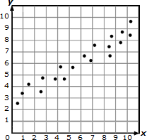
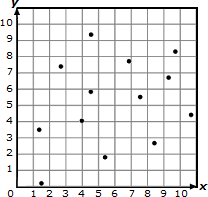
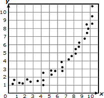 nonlinear association
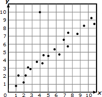